Last updated on January 21st, 2025 at 02:20 pm
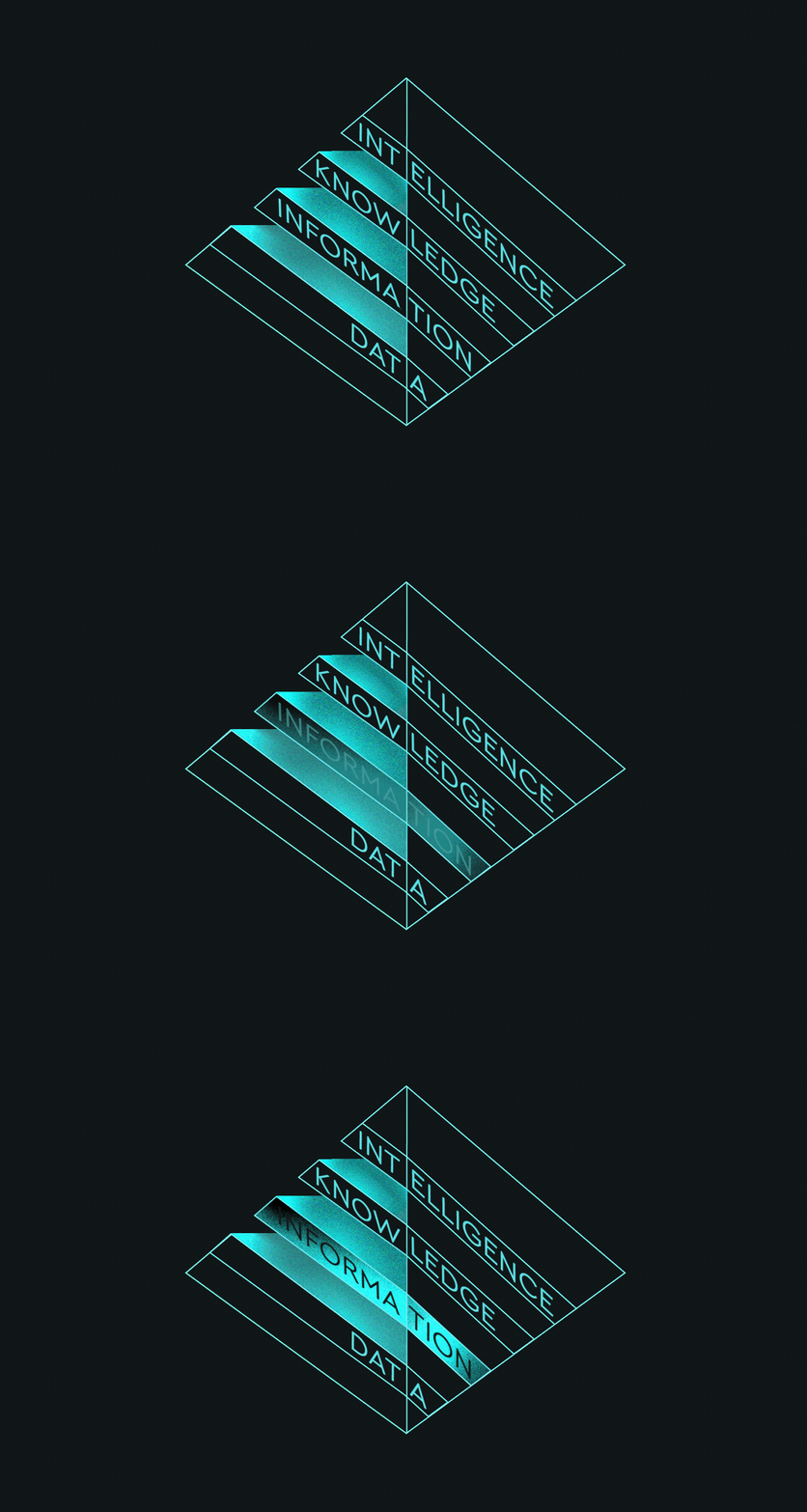
1This article is a continuation of the series “How to Turn Music Data into Actionable Insights”. We will explore the second step of the Data Pyramid – Information and Visualizations. For details on the first step – Data – you can see the article here.
The Information stage of the Data Pyramid involves organizing and visualizing data. Organizing is often done with the use of business intelligence, while visualizations are presented in the form of pie charts, line graphs, tables, etc. This stage of the pyramid answers the question “What happened?” (or What is happening?) in the business.
Data becomes information when it is structured and organized. Some think that organizing and structuring data is not enough and only when data is useful and meaningful then it can be considered information. To combine these two views, we will consider that data becomes information when it is structured and meaningful. The final goal of the information stage is to come up with data visualizations that combine data and information so that conclusions can be made.
Data visualization is the process of translating large data sets and metrics into charts, graphs, and other visuals. Visualizations combine both design and computing skills. There is also psychology involved in how people read and interpret visuals.
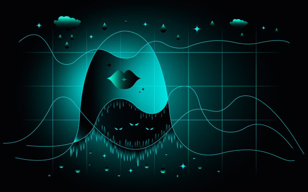
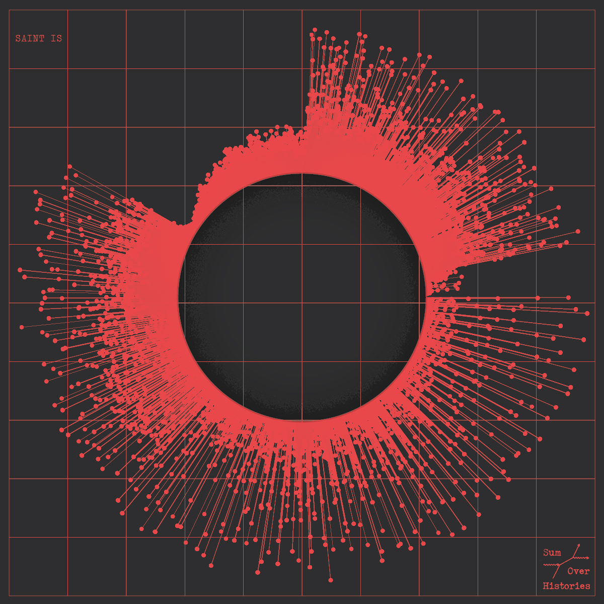
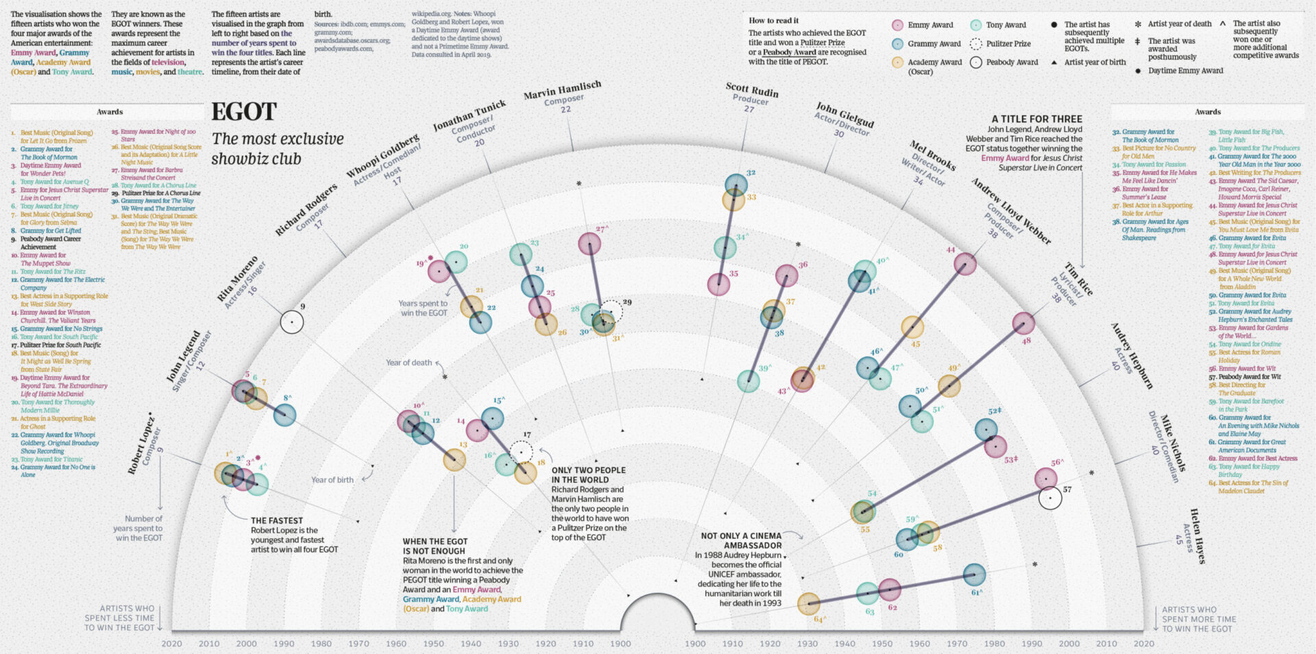
So data visualizations pursue several goals: to communicate information effectively and to present the information in a visually appealing way. Some people even say that data should look sexy and an ideal visualization should stimulate viewer engagement. A great example of this is the work by the London-based Italian information designer Tiziana Alocci who uses visualizations for many different use cases: album covers, corporate visualizations, and editorial infographics.
As an information designer, my job is to visualize data and represent information visually. My most traditional data visualization works involve the design of insight dashboards, thought-provoking data visualizations, and immersive data experiences. For me, the entire process of researching, sorting, organising, connecting, feeling, shaping, and acting is the highest form of human representation through data.
Data visualizations that are used for business decisions are usually expected to be visually appealing and clear and communicate information. So design, data science, and computing knowledge should really work together to create effective data visualizations.
Before data can be analyzed and visualized it is important to decide which data to use as well as ensure the quality of data. For different types of metadata used in the music industry, see the article here. Once the dataset is chosen and analyzed, it can then be visualized either with the help of a designer or using one of the three types of Music Data Visualization Tools:
1. Music Analysis and Discovery Tools
These tools show major characteristics of music such as genre, mood, emotional profile, energy level, etc., as well as show relations between artists and tracks. The idea is that similar tracks can be analyzed in detail and combined into playlists or recommended to customers. Cyanite usually falls into this category of music data visualization tools.
2. Music Visualization Tools for Researchers
These tools are used for research purposes to prove a thesis or provide an overview of the field. For example, Ishkur’s Guide to Electronic Music was originally created as a genealogy of electronic music over the course of 80 years. It consists of 153 subgenres and 818 sound files
3. Marketing Tools
These tools present data visualizations that can be used for sales, advertising, and marketing purposes. They visualize data about consumer preferences, artists’ popularity, track consumption, industry trends, etc. which is not audio sound data.
An example of marketing visualization tools could be web applications such as Pandora AMP and Soundcharts that provide data and visualizations to derive information. Tools like Tableau and Plot.ly allow you to upload raw data and get industry reports.
The general visualization techniques to help represent data in an effective way are trend charts, comparison charts, pie charts, connections, maps, etc. These can be constructed manually or by the computer.
For example, spectrograms are used by Cyanite to train the computer to identify patterns in the audio sounds.
Spectrograms used by Cyanite from left to right: Christina Aguilera, Fleetwood Mac, Pantera
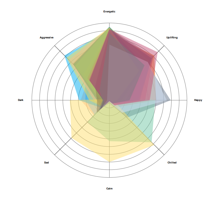
Cyanite’s moods are presented in a comparison chart where overarching mood and the least present mood can be easily identified.
Comparison chart in Cyanite mood analysis project
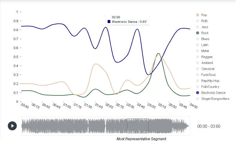
Genre is represented in a trend chart that shows how track’s mean value of genre changes throughout the duration of the track.
Genre trend chart in Cyanite detail view
In this project, representing the history of rock, a connection chart shows how different artists relate to each other in a linear or hierarchical way.
To learn more about data visualization techniques see the article here.
We asked companies specializing in data analysis and visualization how data visualizations are used in their work.
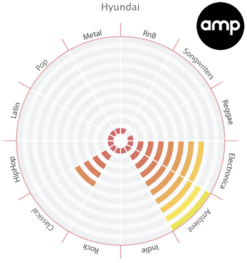
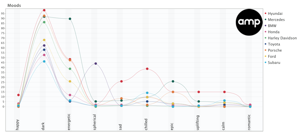
AMP Sound Branding works with data visualization experts and depending on where the company plans on using the data, they visualize it in different ways.
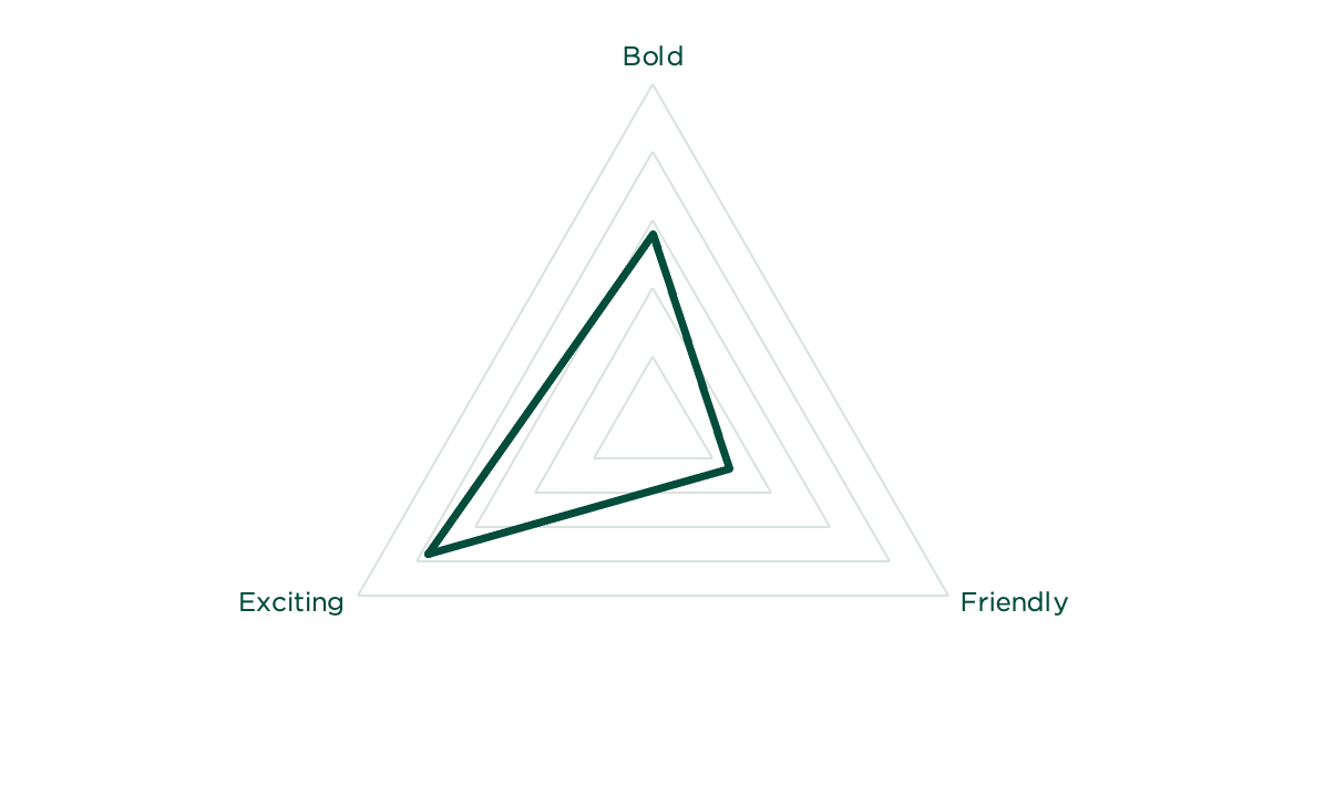
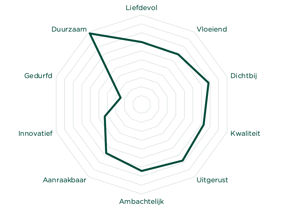
In the research on automotive industry sound, for example, AMP used a combination of Polar area charts and line charts to visualize brand moods and compare.
At TAMBR sonic branding, a big chunk of work is to create a shared understanding of musical parameters that surround a brand.
They say music is a universal language, but more often than not, talking about music is like dancing about architecture. As such, we only start composing once we have agreed on a solid sonic moodboard. For this to happen, we always start with a Cyanite-powered music search based on the brand associations of our client. For each track we present, we also visualize how it scores on the required associations.
TAMBR visualizations take some of the subjectivity away when choosing the right music for a brand. However, these visualizations are merely guidelines, not strict pointers. According to the company, magic happens where data and creativity meet.
Data visualizations are a powerful way to present the results of data analysis and gain additional insights. Visualizations can really improve the process of decision-making. They can also be used on their own in the sales process to impress customers.
However, this stage of the Data Pyramid is also connected to a range of problems. For example, misinterpretations often occur when the output is interpreted as the only truth, disregarding the input dataset and its limitations. Sometimes people rely on visuals so much that they don’t go into exploring the deeper layers of data, missing out on the important information. The human element in algorithms is also a problem. In some algorithms, a human marks the data as important to consider for a machine, so this affects how the algorithm learns and develops. Nevertheless, data visualizations are widely used to present some version of the truth in a clean and digestible format.
You really can’t ignore the simplicity of data visualizations and their ability to navigate the viewer’s attention to the key information. Yet, to get a simple graph, tons of data mining and data analysis work is usually required.
I am interested to visualize my music data with the help of Cyanite – how can I get started?
If you want to get the first grip on Cyanite’s technology, you can also register for our free web app to analyze music and try similarity searches without any coding needed.

