
Making Sense of Music Data – Data Visualizations
Generate consistent music metadata from audio. Sign up for Cyanite.
Music data exists at every level of the industry: in catalogs, streaming platforms, research databases, and brand strategy decks. But raw data on its own doesn’t communicate much. To extract insight, support decisions, or align teams, that data needs to become visible.
Visualization makes music data readable at scale. It transforms analysis results into formats people can interpret, compare, and act on. When done well, it gives fragmented or overwhelming data clarity.
This article explores how music companies use visualization in practice, which approaches work for different goals, and what makes visualization reliable.
Learn more: This article focuses on the visualization layer of Liv Buli’s Data Pyramid model. For context on how raw music data becomes structured and analyzable in the first place, see An overview of data in the music industry.

How can we make sense of music data?
When you’re managing thousands of tracks, visualization answers questions metadata alone can’t resolve. Which moods dominate your catalog? Where are the gaps? How does a single track evolve over its duration?
Charts and graphs make these patterns visible. A comparison chart might show that 60% of your catalog is tagged as “energetic” while only 15% is tagged as “calm”. A trend chart may reveal how a track shifts from ambient to electronic as it progresses. This is information you can use to review metadata quality, understand catalog composition, and pitch music with confidence.
However, if tags are inconsistent or incomplete, the patterns you see won’t reflect what’s actually in your catalog. Structured music data should be consistent, and it starts with reliable tagging at scale.
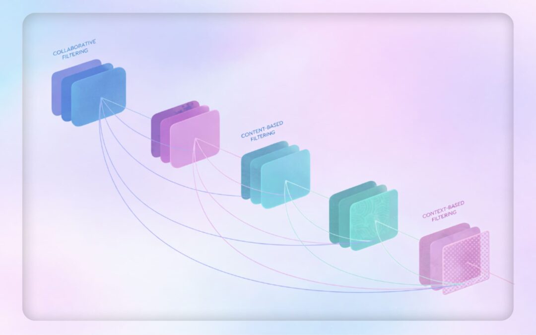
Music data visualization techniques Cyanite uses
Once music data is structured, the next step is choosing the right format to make that data readable. Different chart types serve different purposes in catalog work, whether you’re evaluating a single track, comparing options, or understanding patterns across thousands of files.
Cyanite provides these visualizations in the “Detail” view for each track, covering genre, mood, energy level, instrument presence, and voice presence. Each format is designed to surface specific insights quickly.
Horizontal bar charts display individual attribute scores in a simple, scannable format. They show mood scores like “Energetic,” “Sexy,” and “Happy,” making it easy to compare strengths at a glance.
- Use case: Quickly assess which attributes dominate a track before adding it to a playlist or pitching it for a specific brief.

Radar charts by Cyanite visualize a track’s mood profiles in a circular format. Each axis represents a different mood attribute, and the resulting shape reveals the track’s overall emotional signature. This makes it easy to see which emotions dominate and how they balance against each other. When comparing multiple tracks, radar charts can overlay several mood profiles at once, revealing which tracks share similar emotional characteristics and which diverge.
- Use case: Evaluate a single track’s emotional profile before pitching, or compare multiple tracks side by side to find the best match for a specific brief. Useful when a music supervisor asks for “uplifting but not aggressive,” or when you’re building emotionally cohesive playlists.

Trend charts reveal how attributes change over time within a track. They show how genre shifts throughout a track’s duration, segment by segment. In this example, you can see a track that starts as electronic dance, briefly touches pop and rock elements, then returns to its electronic dance foundation.
- Use case: Find tracks that transition between moods or energy levels. Useful for scene changes, dynamic playlist sequencing, or identifying tracks with intro/outro sections that differ from the main body.

Representative segments identify the 30-second portion of a track that best captures its overall character. Cyanite highlights this segment in the waveform below each visualization, making it easy to preview the essence of a track without listening to the full duration.
- Use case: Create teaser clips for social media, quickly evaluate tracks during pitching, or provide samples for music supervisors who need fast decision-making tools.

Most relevant segments in Cyanite visualize which moments within a track best match a search query. The system analyzes tracks in short segments and highlights the sections that correspond most closely to the intent of a Similarity Search or Free Text Search.
- Use case: Jump directly to the section of a track that fits a brief. This is useful when searching for specific moments like intros, breakdowns, or choruses, and when reviewing many search results in a limited time.

Together, these visualization formats make track composition visible at different scales. With a foundation of consistent tagging, they turn raw data into actionable insight that supports confident decisions about what to pitch, license, or prioritize.
How music companies use data visualization today
Music companies use data visualization to understand their catalogs. Instead of working through raw metadata, teams can use visuals to understand what the catalog includes, how tracks are distributed across genres and moods, and where there are limitations or opportunities.
In practice, it’s helpful in several scenarios:
- Catalog analysis: By reviewing visualizations across multiple tracks, teams can identify patterns, such as which moods dominate their catalog and where gaps exist.
- Brief and pitch preparation: Visualization helps coordinate decisions across people by providing a shared frame of reference when commercial pressure is involved.
- Programming and curation: Visual cues help teams avoid sonic repetition and maintain contrast between neighboring tracks when building playlists or radio schedules.
- Catalog development: Teams can check how new releases sit alongside existing music before they are added or promoted.
Visualization needs to be embedded inside operational tools, where catalog work already takes place, because that’s where decisions are made.
Platforms like Reprtoir and MusicMaster have integrated Cyanite’s visualizations into their products for this reason. By offering sound-based visuals directly within existing workflows, they reflect how central visual analysis has become to modern catalog management.

Why visual appeal matters in music data
In day-to-day work, visualizations help people make decisions. But good visuals need to do more than organize information. They should catch the eye and invite attention to make people want to spend time with the data.
This becomes especially important when data is meant to be shared. As streaming metrics became part of how musical success is discussed, labels began looking for ways to turn abstract performance data into something tangible and visible beyond internal tools.
Visual Cinnamon’s work is one example. They created data art posters for Sony Music based on streaming releases such as “Adore You” by Harry Styles. These posters translate audio structure into circular spectrograms and combine it with streaming context, turning listening data into visual objects people want to look at and share.

Poster design by Visual Cinnamon for the song “Adore You” by Harry Styles
London-based Italian information designer Tiziana Alocci shows us a more expansive take on visual engagement. She uses visualizations for many different use cases: album covers, corporate visualizations, and editorial infographics.


EGOT Club, by Tiziana Alocci for La Lettura, Corriere della Sera, 2019.
As an information designer, my job is to visualize data and represent information visually. My most traditional data visualization works involve the design of insight dashboards, thought-provoking data visualizations, and immersive data experiences. For me, the entire process of researching, sorting, organising, connecting, feeling, shaping, and acting is the highest form of human representation through data.
In business settings, visualizations are still expected to be clear and easy to interpret. But these examples show why visual appeal also matters. When data is readable and visually compelling, people engage with it for longer and trust it more.
Learn more: Benchmarking in the music industry—knowledge layer of the Data Pyramid
How sound branding teams use music data visualization
The balance between design and data science becomes especially important in sound branding, where visualizing music helps teams align on abstract qualities before creative work begins.
We asked companies specializing in sound branding and data analysis how they use data visualizations in their work.
amp Sound Branding works with data visualization experts. Depending on where the company plans on using the data, they visualize it in different ways.
We try to use whatever technique fits the data and the story we are telling best. Often we use polar area charts and spider-graphs as we find them a good fit for the Cyanite data.
In their research on automotive industry sound, for example, amp used a combination of polar area charts and line charts to visualize and compare brand moods.


Overall Moods by AMP
At TAMBR sonic branding, a large portion of their work is creating a shared understanding of the musical parameters that surround a brand.
They say music is a universal language, but more often than not, talking about music is like dancing about architecture. As such, we only start composing once we have agreed on a solid sonic moodboard. For this to happen, we always start with a Cyanite-powered music search based on the brand associations of our client. For each track we present, we also visualize how it scores on the required associations.
TAMBR visualizations remove some of the subjectivity when choosing the right music for a brand. However, these visualizations are merely guidelines, not strict pointers. TAMBR believe that magic happens where data and creativity meet.

Data Visualizations by TAMBR

These examples show how visualization supports real creative and commercial decisions. But what tools make this kind of work possible?
Music data visualization tools
Before music data can be analyzed and visualized, teams need to decide which data is relevant and ensure it’s reliable. Once a dataset has been analyzed, visualization becomes a vehicle for that information to be used in practice. Different tools support this at different points in a music workflow, depending on who is using them and for what purpose.
1. Music analysis and discovery tools
Music analysis and discovery tools consistently categorize and tag tracks, so teams can easily find what they are looking for. They show core musical characteristics, such as genre, mood, emotional profile, and energy level, and make sound-based relationships between tracks readable at scale.
Cyanite falls into this category. It analyzes the audio itself, then applies Auto-Tagging to generate consistent metadata and Auto-Descriptions to provide quick, neutral summaries of how tracks sound. For music search, Cyanite’s Similarity Search (sound-based search), Free Text Search (prompt-based search), and Advanced Search (an add-on to both searches, allowing for custom contextual metadata) help teams locate relevant music efficiently across large catalogs.
Alongside tagging and search, Cyanite visualizes analyzed metadata directly within the web app on each track through graphs. These visualizations show a song’s key characteristics, with a strong focus on mood, so it’s easier to compare tracks without relying on text labels alone. When using Cyanite via the API, the developing team creates the visualizations.
2. Music visualization tools for researchers
These tools are used in research contexts to study music at a broader level. The focus is on analysis and documentation.
Researchers also use these visualization tools to prove a thesis or provide an overview of a musical field. For example, Ishkur’s Guide to Electronic Music was originally created as a genealogy of electronic music over 80 years. It consists of 153 subgenres and 818 sound files.
Through Cyanite for Innovators, we support research and creative projects built on our sound-based music analysis.
3. Music marketing tools
Music marketing tools use data visualization to track how music performs once released. Unlike analysis and discovery tools, they don’t visualize sound itself. Instead, they focus on audience behavior, platform performance, and market response, helping teams understand reach, traction, and growth over time.
Many platforms have native analytics tools, such as Spotify for Artists, Apple Music for Artists, Bandcamp for Artists, and YouTube Studio. These provide first-party data limited to a single platform, including listener counts, streams, saves, playlist additions, and audience location. They can help users understand performance in detail, but only reflect activity within that specific ecosystem.
Tools like Pandora AMP and Soundcharts are often used to provide performance insights beyond a single streaming platform, especially for tracking discovery and audience response at a market level.
In marketing and pitching, Cyanite describes and positions music based on how it sounds. This helps teams explain fit and intent when presenting tracks to clients or partners.
Read more: For a concrete example of how sound-based analysis supports music marketing and pitching workflows, see how Chromatic Talents uses Cyanite in practice.
The promise and limits of data visualization
Music data visualization helps teams make sense of large catalogs by turning structured sound data into something that’s readable and comparable. At its best, it supports clearer decisions and shared understanding around music. But it also has limitations.
A graph is not meant to replace judgment. When the underlying metadata is inconsistent, incomplete, or treated as an absolute truth rather than a point of reference, visuals can be misleading. This is why visualization only works when paired with domain knowledge and active listening.
The quality of a visualization always reflects the quality of the data beneath it. Clean, consistent tagging is what makes patterns meaningful and comparisons reliable. Without that foundation, visuals become surface-level representations with little value.
Cyanite is built with the benefits of data visualization in mind, as well as its challenges. By combining sound-based analysis, structured tagging, search, and visualization in one place, it helps teams compare tracks, spot patterns, and make decisions without disrupting their workflow.
If you want to explore how structured music data supports clearer visualization, try Cyanite for free and see how it works in practice.
FAQs
Q: What is music data analytics?
A: Music data analytics is the process of collecting and organizing information to uncover what’s in a music catalog and how it’s structured. It helps teams understand the whole content of a catalog, not just individual tracks.
Q: Why isn’t metadata alone enough for large catalogs?
A: Metadata is essential, but it has limits at scale. Tags can be inconsistent, incomplete, or too broad to capture nuance. As catalogs grow, it becomes harder to spot patterns, gaps, or overlaps using text alone. Visualization and sound-based analysis make those patterns visible, helping teams compare tracks and make decisions with greater clarity.
Q: What kinds of graphs are used to visualize music data?
Common music data visualization graphs include comparison charts, trend charts, similarity clusters, and catalog distribution views.
Q: Who uses music data visualizations in practice?
A: Music data visualizations are used by catalog managers, music supervisors, sound branding teams, researchers, and analysts.
Q: How does Cyanite support music data visualization?
A: Cyanite analyzes audio directly and turns it into structured data that can be visualized consistently at catalog level.
Q: What are the limits of data visualization in music?
A: Visuals help guide attention, but they don’t provide context or replace human judgment. Charts can be misread if the underlying data or its limitations are ignored, which is why music data visualization graphs work best when paired with listening and domain knowledge.